http://anderspoulsen.blogspot.com.au/2013/10/project-2-sustainable-product-service.html?showComment=1382448659232
The idea of making it a question mark is ingenious, I like it!
Maybe with some attrctive color, it is easier to discover especially when placed at tourists spots with huge crowds.
Ole André Bech
http://bechdesign.blogspot.com.au/2013/10/final-presentation.html
Good work, I like your idea very much, especially the way how siesta is folded and opened, which is very convenient and space saving. The only question is whether it is a good place to choose Bars and clubs as they are not likely to be located near work places. So it may be a problem that people need to go for a while to get to nearest siesta.
Jan raymond
http://janraymondgerardino.blogspot.com.au/2013/10/sustainable-product-service-system.html
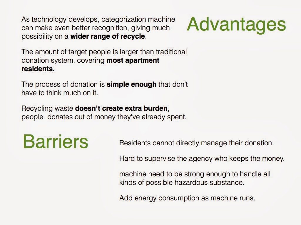
Good idea to get to more public attention, and your poster illustration is clear and logical, quite convincing. Only a small suggestion, you can made the hero shot with a little more perspective so that the machine would look more real and appealing.
Ricky Chu
http://starocean01.blogspot.com.au/2013/10/wk12.html?showComment=1382450428716
Like your idea very much as making a mobile battery so tiny. Again I agree with a above comments saying the plug it is fragile. Maybe putting it at the other end with a cap would be safer. Besides, I don't think the android phones share one standard of charging plugs, maybe Windows phones either.
Qiuyuan Lin
http://haresama.blogspot.com.au/2013/10/project-2-final-posters.html?showComment=1382455535492
Great idea to offer mobile emotional therapy. I just suggest removing the big screen and keeping the sensors and the bluetooth, paring bracelet with your phone via bluetooth when an app on your smartphone is just capable to do the job. Otherwise, the battery is hard to last long and the user may find wearing it tiring as too many components actually weigh a lot.
Your posters are of great layout and look so professional, love them!
Your posters are of great layout and look so professional, love them!